Untitled

ocean

Before writing this post, I read an article about abstract art discussing Piet Mondrian views on art. Mondrian was involved in the De Stijl art movement, an art style focused on isolating a single visual style that would appropriate for all aspects of modern life. The style resulted in implementing geometric blocks of primary colors and vertical and horizontal lines. Mondrian’s art theories greatly affected his abstract art style & his quote about abstract art stuck out to me when looking at this painting, Mondrian said

The emotion of beauty is always obscured by the appearance of the object. Therefore the object must be eliminated from the picture.”  

When I first look at this painting, I see splatters of ink. There seems to be an incident where ink has spilled all over the canvas. Reminiscent of the incident of an ink pen breaking in my pocket and ruining a pair of jeans I had when I was a kid. As I try to make sense of this painting, I run into problems. My eyes scan the painting, and the big splatter of blue paint could be a break of ocean water from the wave, ( the other expanse of blue). Then I run into the problem of what the black circle is surrounding the blue splatter. While the other colors seem random & in no particular order, the black lines seem to be purposeful.

I was drawn to this painting because Blue is my favorite color. Blue is associated with calmness, but I think this painting shows a different side of the color blue. This painting shows the strength of blue, like an ocean, calm but has the possibility to be destructive & explode. Chris could have planted the brown to show that the water had taken over all of the land except for two small parts. Reflecting back on the Mondrian quote earlier mentioned, by Chris not becoming fully immersing in painting the object “perfectly” he is able to express the real message.

  • Carter Atchison, Student, Wofford College

Untitled


chaos

This painting will start off a collection of posts showing Chris’s abstract art that are painted on paper. My interaction with abstract art has always come with the argument that abstract art is simple & easy to do. However, abstract art has always been my favorite art form. I am always curious to hear what the artist is thinking while he is painting the piece. Does the artist have a central theme while he is painting abstractly or is the art random expression? This painting caught my eye because of the sense of chaos & the use of colors.

The title of the painting being “Untitled” allows the viewer to make up his own mind about the emotions being expressed and I believe that a personal evaluation allows for the viewer to get the most of the art. My favorite part of this painting is the white paint, “interrupting” the background colors. This painting reminds me of Risk, a war game that I used to play as a kid. The different colors represent the different armies trying to spread their territory, the white and red colors seem to be at war as the white lines spread like fingers trying to control the red area. This painting represents beautiful chaos to me.

Viewing Stages of a Painting, Five

IMG_3928 IMG_3929 IMG_3935 IMG_3937

The title of this painting is “Sad Mary”… this title is purposely vague to leave it up to the viewer as to which “Mary” this painting may refer to. In image 1 you can see that this painting started out as a work on paper – it is “clipped” to the easel on the left for reference for the larger painting.  The first pass of the larger painting was spontaneous and only took a few minutes.

I worked quickly with large brush strokes and even let the paint that ran off her chin remain as it became more complete.  In the earlier work Mary looked masculine and I gradually softened the lines and shapes to make her more feminine as I continued. The started the skin tones in black and white and added color as I went along.  In the final version Mary looks noticeably sadder than the previous three.  I increased the size of the inside of her hood as I went along. I ended up subduing the black shadow throughout the painting by the time I completed the final draft. I moved away from the orange color in the bottom left corner. Then, I shifted to a more yellow shade in the upper left corner in the final draft.

Funny the processes used in painting – it just happens and I have learned “when to stop” – which is an art of it’s own!


Lakelife Magazine – Chris Cook Artist

Wow. I am continually surprised and grateful for interest in my work. I get emails from time to time with comments about one of my paintings or an occasional walk in from a tourist to look around my office that serves as a “gallery” of my work.  However, this latest article about my paintings has really hit the mark.  I am getting stopped all over Madison with people saying, “I saw that great article about you”. 


lake-life-mag

I am so thankful for Beverly Harvey with the Eatonton Messenger/Lake Oconee News for writing the story in Lakelife Magazine.

The article is in their latest magazine – Winter 2014. If you do not already have a copy, please go find and one in the Georgia’s Lake Country area.

The issue is overall very nice and I am so proud to be right in the middle of it.

For those who are interested, go check out the Publicity Page on my website (click here) to see a list of other mentions of my work out there – you may be surprised!

Thanks,

Chris


My Paint Studio

studio-headerDSC_00031


Chris’ studio totally fits his style both as an individual and as an artist. From the outside, it looks quaint, southern and rustic. Inside, its a modern/simplistic space with bright lighting, and plenty of room for Chris to create his paintings and to draw inspiration from life, scripture, or other works of art.

Chris describes himself as a “fast painter”. He says that he doesn’t linger on a work too long, but rather paints what he sees and feels and then is done with the process. I love seeing his work, and totally feel like the space that he creates in is totally reminiscent of him and his style. He is consistently able to blend a touch of modern with an intentional nod to the classics and a somewhat simpler time and place into his work. I also love the fact that the website design studio doubles as a showcase for all of his beautiful artwork!

Chris Cook is a premier southern artist and owner of Madison Studios, a web design, maintenance, and e-commerce and marketing company. For his artist biography, contact information, or to view more of his work, click HERE

Night Cabin:

night-cabin


I am a “Mountain Person”. If you read the previous blog about mountains at dusk, you’ll understand my opinion about the two types of people in this world (beach and mountain). Which one are you?

When I say that I am a mountain person, I do not mean that I don’t like sitting on the beach, watching the waves roll in and breathing in the salt air. What I do mean is that there truly is no substitute for a few days, or even several hours spent in the crisp, clean mountain air. Many of my favorite memories from trips and vacations involved being in or around mountain streams, cabins, and campfires with the people that I love. There’s really nothing quite like being there.

Two memories in particular permeate my mind as I think about my fond memories of mountains. One is a time that I spent with a few close friends hiking on the Appalachian Trail. I can remember one of the clearest nights of my lifetime, sitting by the glow of a fire and staring across the gap at one of the most vast expanses of stars that I can remember. The other is a weekend retreat that my family took to a cabin in the North Georgia mountains. I can still remember sleeping in the loft, walking through the rustling leaves down by the creek, and the crisp feeling of the air on that weekend.

When I look at this painting by Chris, I find peace in my memories and thoughts of time in the mountains. I think that he does a very good job of composing this image. As a “mountain person” I take delight in all of the mountain elements that he brought into this picture. I love the glint of snow, the halo over the clouds from the bright moon, the towering trees, and the cool creek that is running beside the cozy cabin.

His art, regardless of the subject matter or style, seems to inspire emotion and evoke memories and feeling. I really like this painting because of the way that it makes me feel. Maybe i’m partial, but it really does make me feel good when I look at it.

Chris Cook is a premier southern artist and owner of Madison Studios, a web design, maintenance, and e-commerce and marketing company. For his artist biography, contact information, or to view more of his work, click HERE.

Old Country Church

church-sky

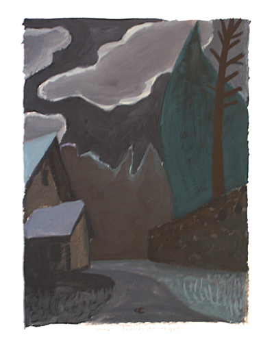
They say that a picture is worth a thousand words. If that’s true, it’s fitting for me that I am tasked with writing words about the pictures that Chris creates with his art. The job seems insurmountable at times; I get charged with writing down something that, when people read it, they better understand the how and why of the painting, as well as taking a moment to contemplate life through a lens that is shaded by the perspective of both Chris as an artist, and myself as an author. Chris creates pieces of artwork that capture moments from scripture, history, and today’s life that spark a gamut of emotions, thoughts, and memories for his audience, all while sampling from numerous artists that he appreciates (as an avid art history buff) and pays homage to in both style and subject matter. (No pressure, right?)

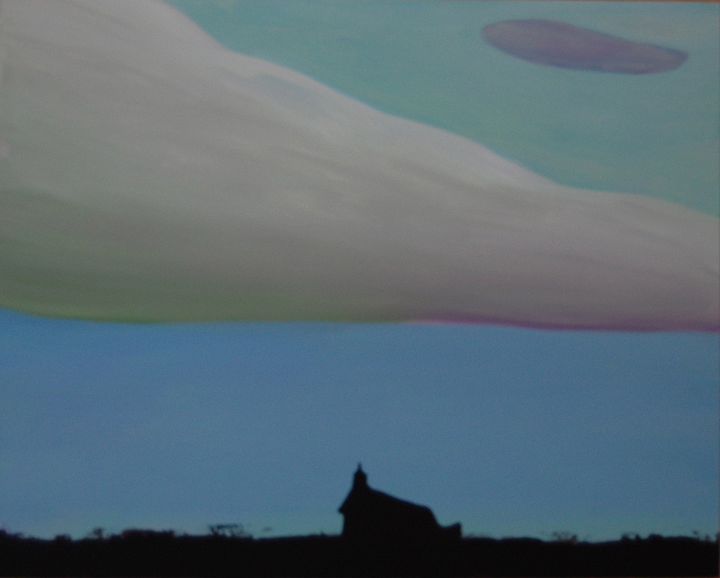
I came across this painting as I was searching for my next blog post topic. It’s a very small country church, surrounded by a lot of open space and a picturesque evening sky. It spoke to me on several levels, and I knew that I had to write about it.

1st- The perspective of seeing the church from a distance, in the middle of nowhere. It seems fitting that the church can do just that – be standing out in the middle of what could seem like a vast expanse of “wilderness”, both in the world, and in the hearts of the people in it. The familiar silhouette of the pitched roof and steeple serve almost as a beacon, as if coming from a lighthouse, shining out into the country.

2nd – My grandparents went to a small country Baptist church in Godfrey, GA that closely resembled the one in this picture. I have lots of memories of the uncomfortable pews, creaking floors, and low attendance numbers on Sunday mornings.

I begin to think about little churches like this one, and about the Church in general. For years, the Church (big C, the body, not the building) has been an institution of refuge and safety for those who come into it’s fold. It’s stood for love, acceptance, generosity, care, and hospitality. Here in rural Georgia, there are small country churches just like this one dotting the backroads all around.

As time has progressed it seems like the church (little c this time) has begun to shift it’s “look”. More and more, little buildings with pitched roofs and steeples seem to be closing their doors, and the congregations are gravitating more towards buildings in cities and towns that are less about steeples, suits, and shined shoes, and more about being the Church (with a big C). This is not to discredit the work, depth, or worship of the churches  in the past at all, but is merely a reflection about the trend of moving from little c to big C churches.

I’m not entirely sure what the impact of this movement really will be, or if it is a “good” or “bad” thing. It’s just an observation… It seems that our churches, along with the world, are becoming more and more centralized, nationalized, and connected to the rest of the world in a very real way. The small country churches like the one in this painting seem to be going the way of the dinosaurs, as we move more into auditorium style venues with padded chairs, lights, and stages.

I know one thing for sure. Regardless of the future of how the church looks, the Church will carry on, and the message will continue to prosper and change lives.

So, what do you think? What will the church look like in 15 years? What will the Church look like in 15 years? What are your preferences? What do you see when you look at this painting? How does it make you feel about the church?

Chris Cook is a premier southern artist and owner of Madison Studios, a web design, maintenance, and e-commerce and marketing company. For his artist biography, contact information, or to view more of his work, click HERE.

For the record, there are only 691 words in this post, not 1,000. 🙂

Pinterest
Instagram