The Queen of Soul

The world lost a wonderful woman when Aretha Franklin passed away last week. She was a force to be reckoned with when she sang, and I don’t think anyone else can quite capture the emotion and soul she put into her music.

This painting reflects the hope and youth that was embodied by Aretha throughout her whole life. Her face also shows though the hardships and turmoil that she experienced in her years. From her mother passing away from a heart attack before Aretha turned 10, having children at the ages of 12 and 14, and being in a violent marriage, she truly went through a lot. I feel like her music truly reflects this because she sings with such power and sureness; it’s almost as if these hardships were not hardships at all. They were events that would in the end make her stronger and more powerful singer.

In addition, Aretha was admired by so many due to the fact that she never sang a song the same exact way twice. She would emphasize more on certain portions due to the emotion she felt and also the energy from the audience. She left the crowd speechless after her performance at the Kennedy Center Honors, and this was the case with many (if not all) of her performances.

I can say that Aretha will be dearly missed, but her impact will never be forgotten due to her music living on forever.

-Tori


Jesus’ First Miracle

The original core idea of this painting came to me looking at a book on the artist George Tooker.

Jesus’ first miracle here on earth was turning water into wine at a wedding festival. His mother, Mary must have known the family as she seemed to be involved with the organization, not just an invited guest. She must have also brought her son (that she knew was divine) with her… that is interesting in itself – think about it… “I should bring Jesus himself to a wedding party”!

Anyway, back to the story, she did bring Jesus and good thing as the family did not properly estimate the amount of wine for the multi-day wedding festival. What I tried to depict here in this recording of Jesus performing his first miracle is from the point of view of Mary.

She has asked her son, whom she was told from the beginning was to be the savior of the world, God in human form, conceived by the holy spirit to help this family. When she asks him, here is what happened… “Woman, why do you involve me?” Jesus replied. “My hour has not yet come.” Her response was not a direct reply to what He said to her – but – His mother said to the servants, “Do whatever he tells you.”

I tried to capture her thoughts after he performed the miracle of “He is the Son of God and now everyone will know” This starts everything in motion.

Enjoy watching some of the steps I went through including Mary’s hand… felt it was not looking like a real hand and started back with painting the bone structure and then “put flesh back on it”.

Untitled

12-DSC_0005


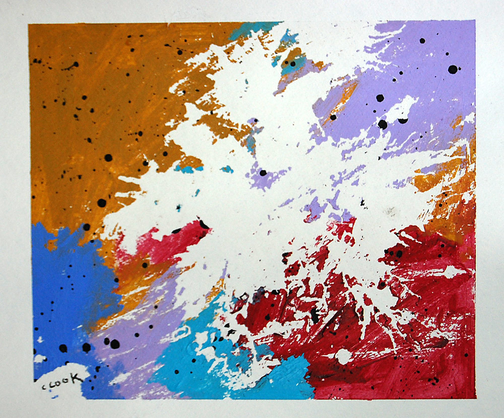
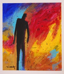
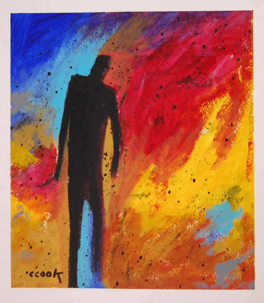
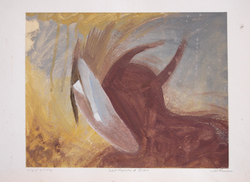
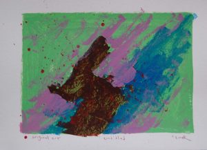
Our experiences shape our viewpoints. Consequently, everyone sees things differently. When people see this painting, they see a figure surrounded by a color explosion. They reach certain conclusions about what the colors are expressing about the figure. Some people may wonder why the figure is not a white figure, connected with peace and innocence. The figure is a dark contrast to the color explosion. Another part of everyone seeing things is the way humans see color. We see colors by different light rays coming into our eyes and our brain registering them. I would conclude from this, that we all see colors differently, even if the difference is a fraction of a shade in difference in color. The red I see in this painting could be much different than the way you see it or a tad lighter or darker.

I have a certain love for abstract paintings more than other type of paintings. Abstract paintings are known for being theoretical and not actually existing, but I believe that abstract paintings are the most realistic paintings. These paintings show our emotions, our beliefs and our dreams because they start out with no defined goal. As the artist begins the abstract, he has no rigid goal, but as the artist lays down the paint, he begins to see patterns. Chris realizes that certain colors would not mix with the other colors in this color explosion. Even though there are abstract paintings, these paintings are still influenced by the teachings and ideas of art the artist possesses. At some point in this artistic expression. Chris had to decide if he would have this figure in this painting. Chris had to decide if the figure would play a role in the expression of the painting. These paintings are realistic to our reality because we come into this world with no defined goal, but as we grow into a our person, we see certain patterns and make certain decisions leading to our final masterpiece as a person.

I am grateful that Chris put the figure in the painting, because I would not have had the revelation I had after studying the painting for a while. I leave for college this week, and I would assume that I am supposed to be nervous. College will be something I have never experienced before, but I am still trying to decide if that is an opportunity or a chasm filled with problems. I connect with the figure, I am the figure. The color explosion is the world around me. Giving me advice and telling me how to live and what to live for. The colors are also the obstacles I will face as I begin to figure out who I am. Many people will shrink in the face of this challenge and follow other people to protect themselves. It is much easier to live a life with other people’s values and expectations so you can blame them for your unhappiness. It is much harder to go into the world, determined to find out the world for yourself. The world is filled with much less people with “convictions”, convictions are fostered by contemplating on something in solitude. To live for something, you must believe come to the conclusion yourself. I do not want cheap beliefs that I have borrowed from others, I want my own beliefs.

I am not saying that by coming to conclusion by yourself, you will completely understand human reality or be more intellectually advanced than others. We cannot fully understand our human reality until after death. I have come into this world, to change something, to leave my mark. I am not here to leave a mark for anyone else, I will take the opportunities the world has given me. I have learned from many other people and will continue to learn from many more. But it is time, to come to my own conclusions. I am ready to live a life with convictions that are strong and lead me to the life I am destined to live.

When I was at Younglife volunteering at a camp for a month, a friend of mine Lee Wicks told me a quote that I will live my life by

“We choose to go to the moon, not because it is easy, but because it is hard” – John F. Kennedy.

An easy life is a life not worth living. I’m ready to be the figure going into the explosions of color in this life. Love you Dad, hopefully I’ll do something cool with my life. And hopefully, I learn something about writing.

  • Carter Atchison, Student, Wofford College

Untitled

devilmask

All of the paintings discussed in this series of posts has been painted on paper. As I dwelt on this fact, I started wondering if these paintings were just random acts of expression or a beginning phase of a painting that he never put on a canvas.

This painting is the first in the series that depicts a “human” figure. The background for the painting is a light blue and yellow which is a sharp contrast from the dark red figure. The yellow is at the top of the painting and the lower left side of the painting. In the lower left, the yellow seems to be an explosion of color, expanding as far as it can go. There is a white shape that seems to be covering the figures face, similar to a mask. The interesting part that stuck out to me was that the mask seems to be slipping off the figure’s face. As though, the figure’s identity was about to be revealed. The figure also seems to have horns in the back of his head, but the mask cannot cover the horns. The mask cannot hide all of the true thoughts of the figure. The horns allude to the figure resembling a devil figure.

This painting is a testament to the belief that masking our intentions is never truly successful. After looking at this painting for a while, I noticed a couple words written underneath the painting. These words say “Last Moments of Judas”, and I had a revelation about the meaning of the painting. Chris has painted the dark red figure with horns to portray Judas. Judas’ mask is falling off as he is about to die, but the horns were never concealed to Jesus and God. The story of Judas has always been an interesting one to me. Jesus and God let Judas betray Jesus ultimately leading to Jesus’ death. But Jesus knew what his destiny was and did not interfere with God’s plan. The betrayal of Judas raises the question, “Did Judas believe that Jesus and God were all powerful?”. Hard to imagine a man betraying the one who created everything.

Untitled


p1p2 
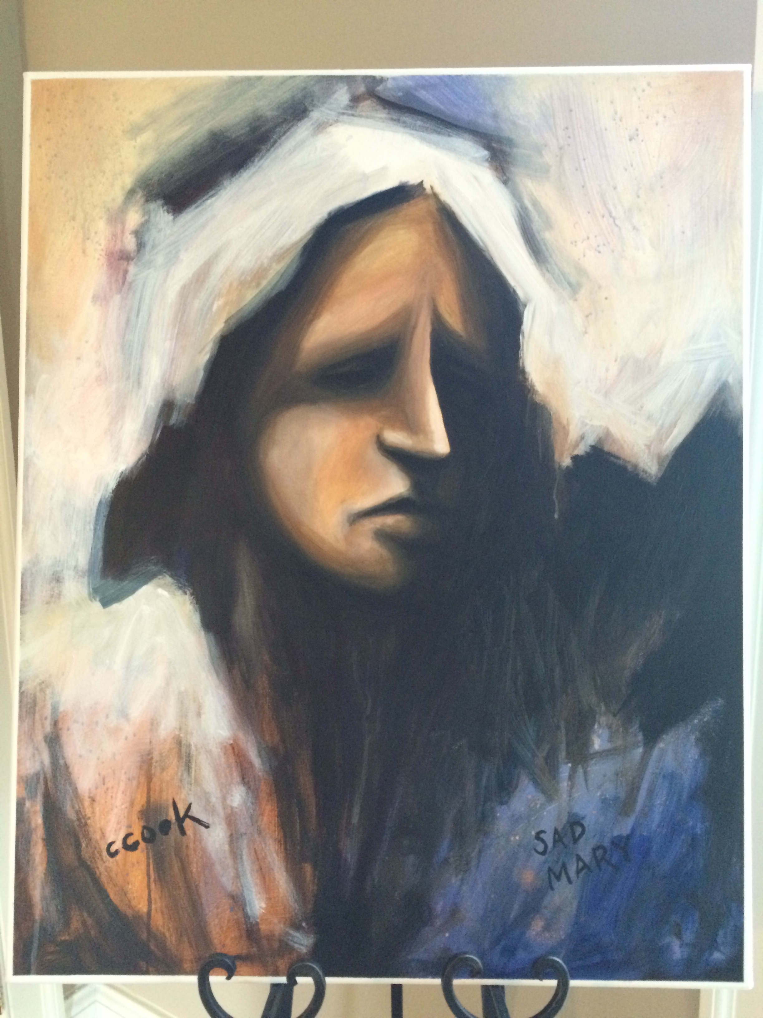
As I write this post, a recent memory springs up in my mind. Earlier this year, my dad had an art show at the Steffen Thomas Museum focused on Christian Art. One afternoon, Chris and I decided to go over there so I could look at his show. I am always amazed at my dad’s art and this was no exception. As we went from painting to painting, I could not imagine the countless hours he spent on each one of these paintings.

However, our trip did not last countless hours as I looked over  30 paintings in about twenty five minutes. This was not due to my lack of interest, but more to my novice mindset towards art. Art is similar to most skill activities in that people that are active in said activity can better understand and articulate the small actions that lead to a great piece of art, a great football play, or a great movie. I am embarrassed to say that I did not pay close enough attention to the intricacies of my dad’s art, but I accepted to write these articles in hopes I could learn more about my dad’s favorite past time.

Is painting two pieces that are strikingly similar, a lack of creativity or a different expression of the same idea? When I first saw these two paintings side by side on Chris’s website, I could not distinguish if one was just the finished product of the other. The first painting seems to have larger and thicker brush strokes than the second, which has more white spaces separating the strokes. Both paintings are surrounded by a black box that has an opening on the northwest corner. The opening could be an escape from whatever the black box contains. But I do not believe that the box holds evil or Chris would have used a different color than a calming light blue. Imagine the light blue being replaced by a dark red, the paintings would have a menacing feel to it. The shapes inside the black box make the painting continue on and on like a hole going to nowhere.

One aspect that I love about both of these paintings, Chris lets the art happen instead of “correcting” the mistakes. In the second painting, there are black dots right above the black box looking as if they it was an accidental drop of paint. If this was my painting, I would most definitely try to cover up “this mistake” and enlarge the top black line. But this would make the painting lose its integrity as thin strokes. The black dots are my favorite part of this painting, they immediately draw my eyes and show a contrast from the first painting.  Painting two paintings that are similar may be to some a lack of creativity, but I believe that Chris was not finished expressing his idea and needed two paintings to show that idea. Or, he just likes painting black and blue squares which is still pretty cool if he paints like this.

  • Carter Atchison, Student, Wofford College


Untitled

ocean

Before writing this post, I read an article about abstract art discussing Piet Mondrian views on art. Mondrian was involved in the De Stijl art movement, an art style focused on isolating a single visual style that would appropriate for all aspects of modern life. The style resulted in implementing geometric blocks of primary colors and vertical and horizontal lines. Mondrian’s art theories greatly affected his abstract art style & his quote about abstract art stuck out to me when looking at this painting, Mondrian said

The emotion of beauty is always obscured by the appearance of the object. Therefore the object must be eliminated from the picture.”  

When I first look at this painting, I see splatters of ink. There seems to be an incident where ink has spilled all over the canvas. Reminiscent of the incident of an ink pen breaking in my pocket and ruining a pair of jeans I had when I was a kid. As I try to make sense of this painting, I run into problems. My eyes scan the painting, and the big splatter of blue paint could be a break of ocean water from the wave, ( the other expanse of blue). Then I run into the problem of what the black circle is surrounding the blue splatter. While the other colors seem random & in no particular order, the black lines seem to be purposeful.

I was drawn to this painting because Blue is my favorite color. Blue is associated with calmness, but I think this painting shows a different side of the color blue. This painting shows the strength of blue, like an ocean, calm but has the possibility to be destructive & explode. Chris could have planted the brown to show that the water had taken over all of the land except for two small parts. Reflecting back on the Mondrian quote earlier mentioned, by Chris not becoming fully immersing in painting the object “perfectly” he is able to express the real message.

  • Carter Atchison, Student, Wofford College

Untitled

untitled2
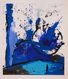
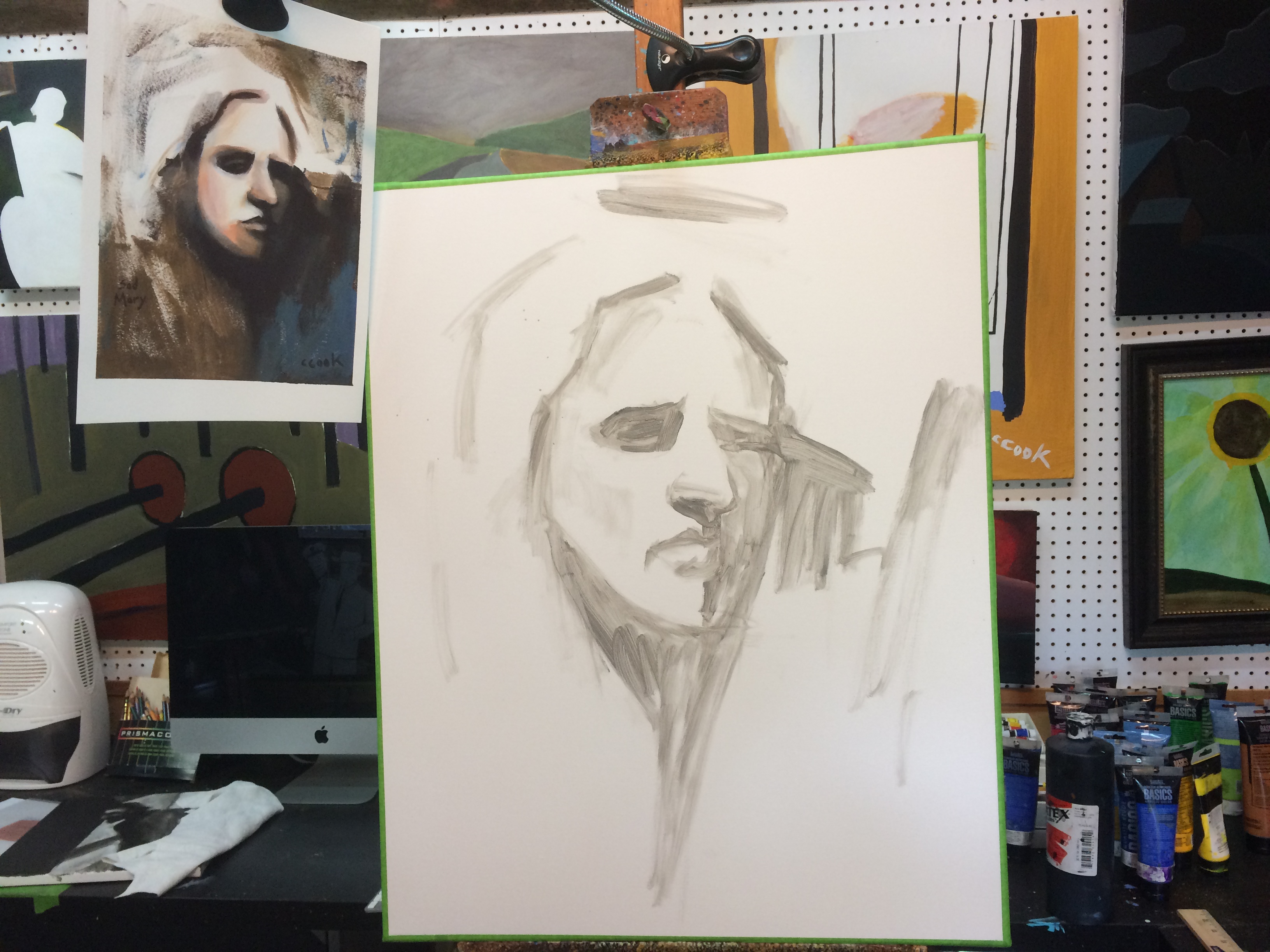
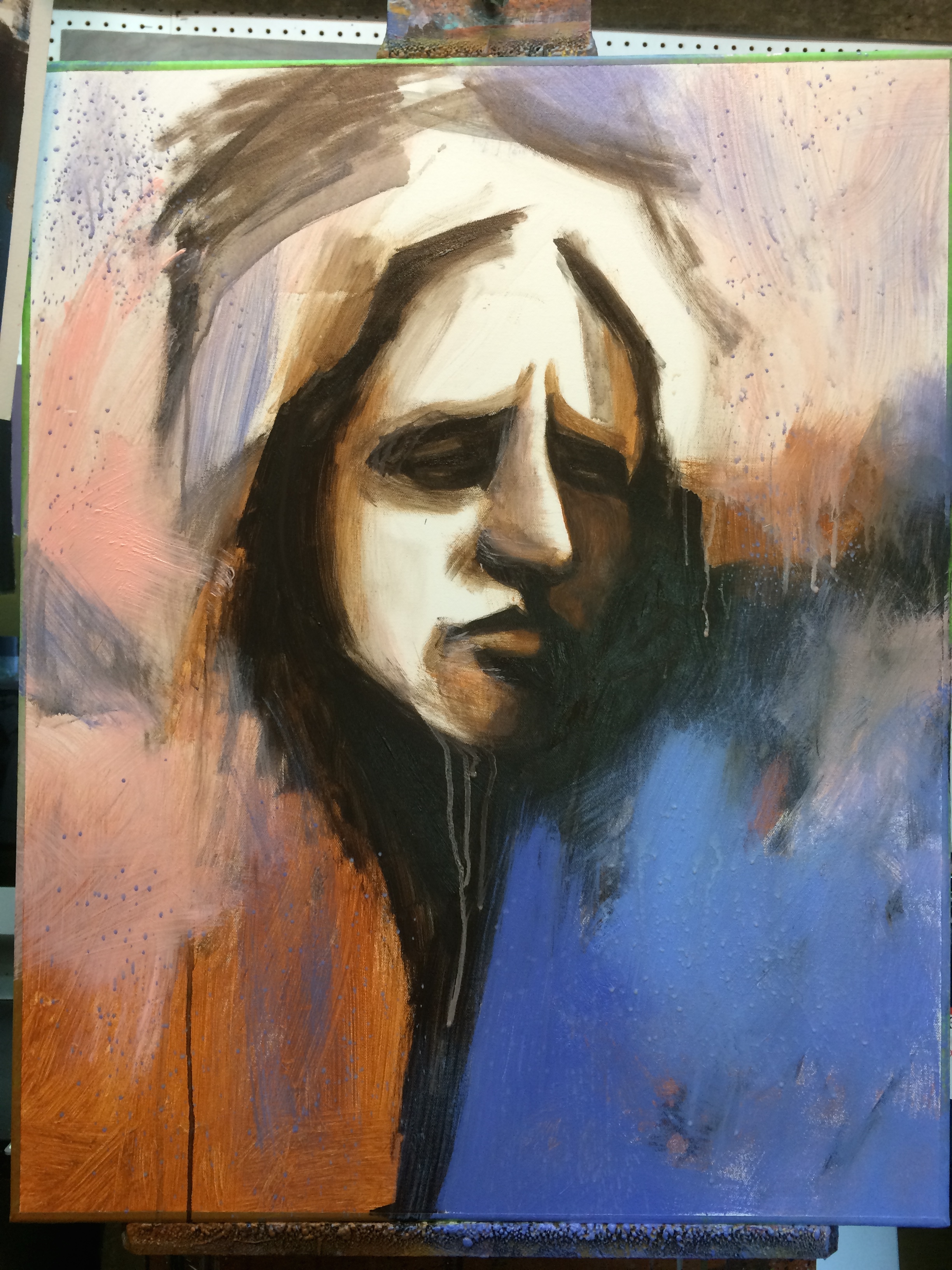
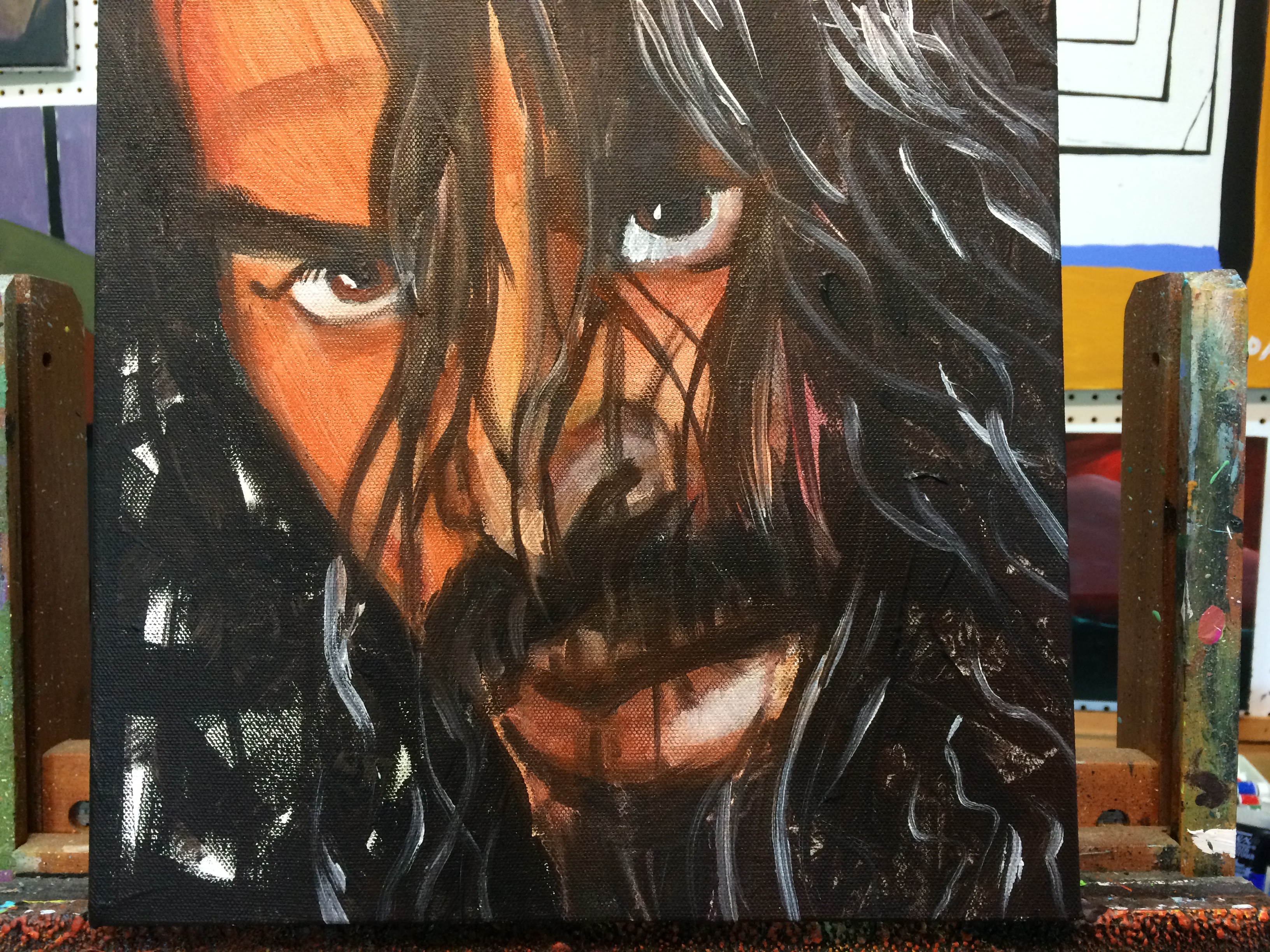
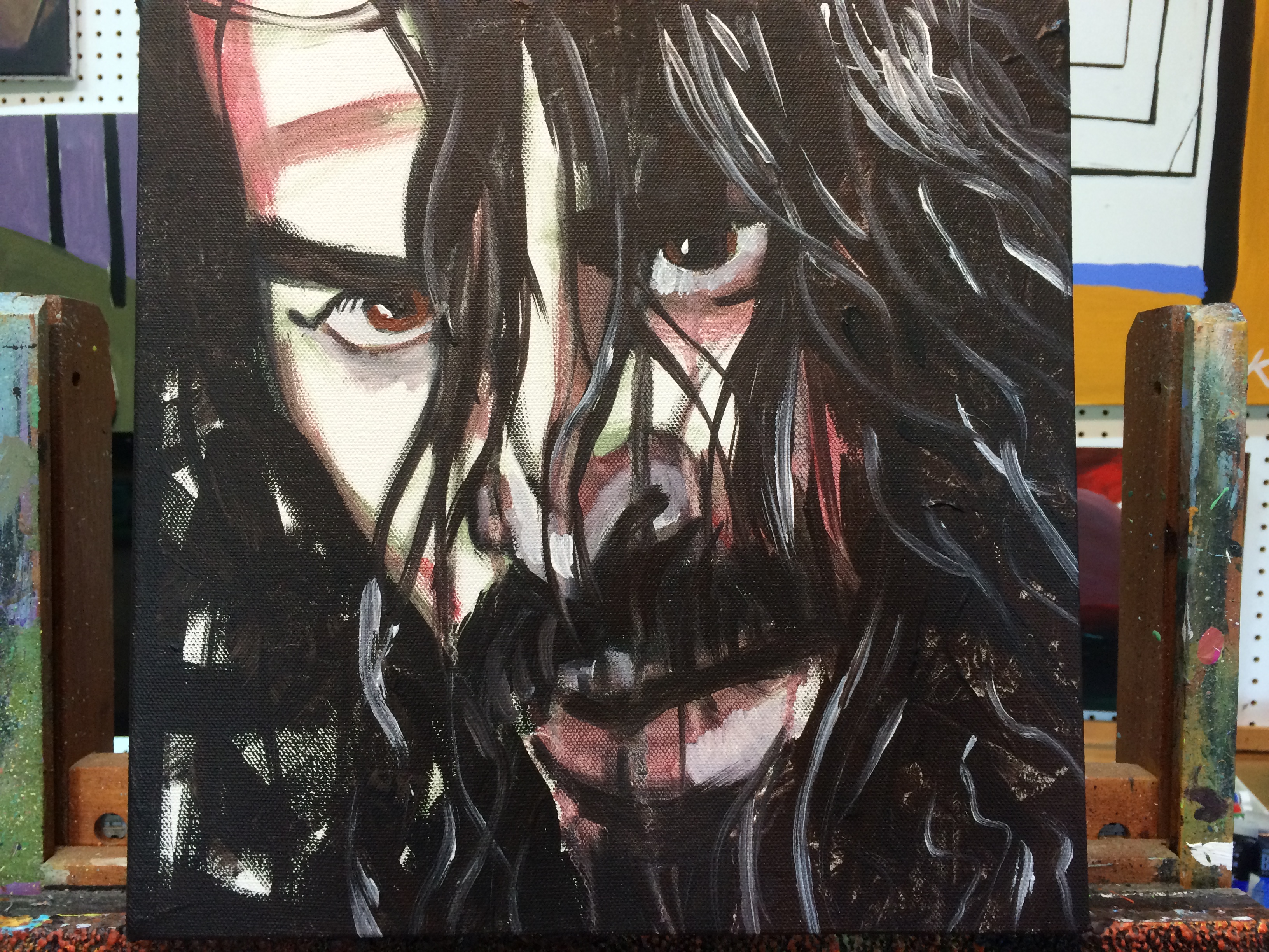
As a kid, the few times painting with my dad in his art studio is one of my fondest memories. My art career was relatively short, but my art style was eerily “similar” to his, or at least that was my goal (This was never accomplished). Our childhoods greatly affect how we experience the world and how we express our creativity. Chris’s father painted houses as a career and Chris would come paint the houses. I am not well versed in the art of painting houses, but I can confidently say that abstraction & creativity are not norms for painting houses in the South. A homeowner  would be furious if their house ever looked like this painting with splotches & random colors on it. The homeowner would probably hear complaints from his neighbors, Southern hospitality. I am always curious on how my grandfather’s occupation with purposeful & little abstract painting affected how Chris looks at painting.

At first glance, I swore that the brown in this painting was an abstract dog playing in a puddle surrounded by a green landscape. After a little reflection though, I take back that assumption for two reasons. First, I believe that as humans when we see anything, we try to make sense of it. Whenever anyone sees abstract art, they try to put it in a category, try to understand it, instead of just experiencing it. My second reason for taking back the dog assumption is because, quite simply, my dad does not like pets enough to do an abstract painting of one.

Similar to the last painting, there are a mixture of colors clashing together. But even more than that, there are “random” red splotches everywhere on the painting. What convinced Chris to put red splotches on a painting that most would assume does not need any red? Why put more or less red splotches on an abstract painting? Its amazing to see all the creative art expression of Chris, because has hundreds of these small paintings on paper.

Carter Atchison, Student, Wofford College

Untitled


chaos

This painting will start off a collection of posts showing Chris’s abstract art that are painted on paper. My interaction with abstract art has always come with the argument that abstract art is simple & easy to do. However, abstract art has always been my favorite art form. I am always curious to hear what the artist is thinking while he is painting the piece. Does the artist have a central theme while he is painting abstractly or is the art random expression? This painting caught my eye because of the sense of chaos & the use of colors.

The title of the painting being “Untitled” allows the viewer to make up his own mind about the emotions being expressed and I believe that a personal evaluation allows for the viewer to get the most of the art. My favorite part of this painting is the white paint, “interrupting” the background colors. This painting reminds me of Risk, a war game that I used to play as a kid. The different colors represent the different armies trying to spread their territory, the white and red colors seem to be at war as the white lines spread like fingers trying to control the red area. This painting represents beautiful chaos to me.

Viewing Stages of a Painting, Five

IMG_3928 IMG_3929 IMG_3935 IMG_3937

The title of this painting is “Sad Mary”… this title is purposely vague to leave it up to the viewer as to which “Mary” this painting may refer to. In image 1 you can see that this painting started out as a work on paper – it is “clipped” to the easel on the left for reference for the larger painting.  The first pass of the larger painting was spontaneous and only took a few minutes.

I worked quickly with large brush strokes and even let the paint that ran off her chin remain as it became more complete.  In the earlier work Mary looked masculine and I gradually softened the lines and shapes to make her more feminine as I continued. The started the skin tones in black and white and added color as I went along.  In the final version Mary looks noticeably sadder than the previous three.  I increased the size of the inside of her hood as I went along. I ended up subduing the black shadow throughout the painting by the time I completed the final draft. I moved away from the orange color in the bottom left corner. Then, I shifted to a more yellow shade in the upper left corner in the final draft.

Funny the processes used in painting – it just happens and I have learned “when to stop” – which is an art of it’s own!


Viewing Stages of a Painting, Four

IMG_3795 IMG_3796

Sometimes in the painting process I reach a point where I don’t know if I should continue painting or leave it as it is.  For this particular painting, John the Baptist, I reached a point where I was pleased with the progress and I left it dormant for a week or so. When I revisited the painting I decided to add some flesh color and I really think it breathed new life into the painting.  Which version do you prefer? Lighter or Darker skin tone?

Pinterest
Instagram