 As I write this post, a recent memory springs up in my mind. Earlier this year, my dad had an art show at the Steffen Thomas Museum focused on Christian Art. One afternoon, Chris and I decided to go over there so I could look at his show. I am always amazed at my dad’s art and this was no exception. As we went from painting to painting, I could not imagine the countless hours he spent on each one of these paintings.
However, our trip did not last countless hours as I looked over 30 paintings in about twenty five minutes. This was not due to my lack of interest, but more to my novice mindset towards art. Art is similar to most skill activities in that people that are active in said activity can better understand and articulate the small actions that lead to a great piece of art, a great football play, or a great movie. I am embarrassed to say that I did not pay close enough attention to the intricacies of my dad’s art, but I accepted to write these articles in hopes I could learn more about my dad’s favorite past time.
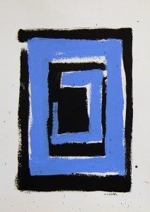
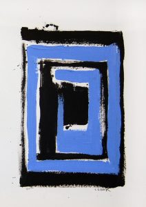
Is painting two pieces that are strikingly similar, a lack of creativity or a different expression of the same idea? When I first saw these two paintings side by side on Chris’s website, I could not distinguish if one was just the finished product of the other. The first painting seems to have larger and thicker brush strokes than the second, which has more white spaces separating the strokes. Both paintings are surrounded by a black box that has an opening on the northwest corner. The opening could be an escape from whatever the black box contains. But I do not believe that the box holds evil or Chris would have used a different color than a calming light blue. Imagine the light blue being replaced by a dark red, the paintings would have a menacing feel to it. The shapes inside the black box make the painting continue on and on like a hole going to nowhere.
One aspect that I love about both of these paintings, Chris lets the art happen instead of “correcting” the mistakes. In the second painting, there are black dots right above the black box looking as if they it was an accidental drop of paint. If this was my painting, I would most definitely try to cover up “this mistake” and enlarge the top black line. But this would make the painting lose its integrity as thin strokes. The black dots are my favorite part of this painting, they immediately draw my eyes and show a contrast from the first painting. Painting two paintings that are similar may be to some a lack of creativity, but I believe that Chris was not finished expressing his idea and needed two paintings to show that idea. Or, he just likes painting black and blue squares which is still pretty cool if he paints like this.
- Carter Atchison, Student, Wofford College